Showcasing tools that help automate the building design process
B2C - web - AEC product features
----
Overview
UpCodes was set to launch their new product features at the end of 2019. The new features were intended to improve the existing work flow for architects by streamlining the code research process.
With a short timeframe, I created new design components to be integrated to the existing user interface. The primary goals were to showcase the value of the new features and encourage users to become premium members to access these features.
Additionally, I helped resolved other ux issues of the features and navigation from google search pages to main content.
CLIENT
UpCodes is a digital platform for architects, engineers, and contractors to access building codes
ROLE
Product Design Consultant
SCOPE
UI/UX Design, Interaction Design, Prototype in 4 weeks (Status: Delivered + Shipped)
SOLUTION PREVIEW
BEFORE
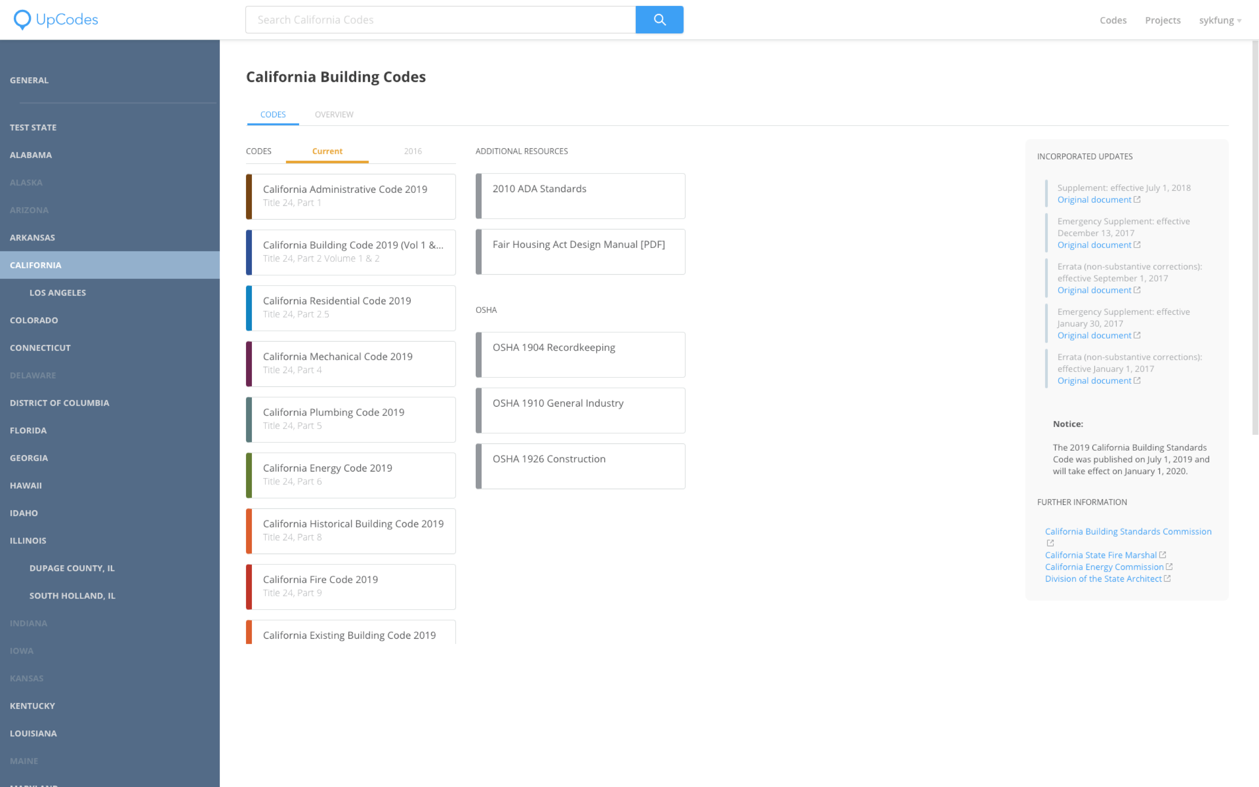
Specific state page with single access point to tools from navigation bar under Projects.

AFTER
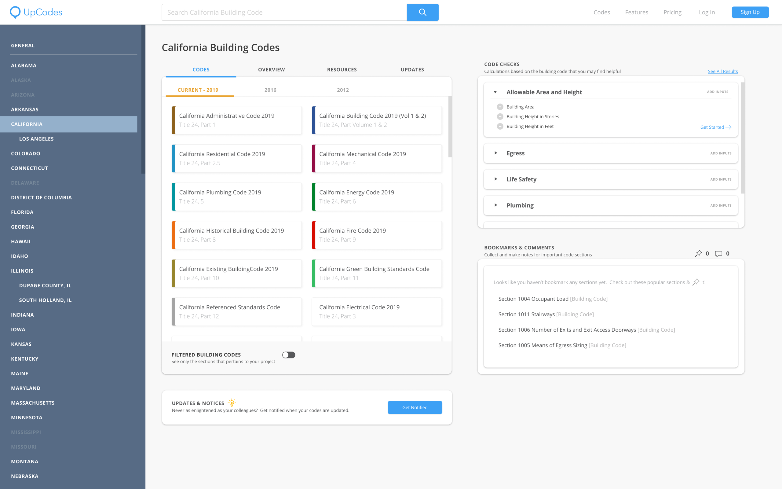
This is the state page before redesigned integrating code check calculators (new feature), filtered code option (new feature), and bookmarks + comments.

Context
How can we best show these tools so users are inclined to use them?
CONSTRAINTS
Short timeframe, Minimal research. Because the primary goal was to get it out to the hands of users, I wasn't able to conduct interviews with users. However, I did work with notes with user interviews and leverage data from Google Analytics to drive design decisions.
RESOURCES
![]() Google Analytics
Google Analytics

From Google Analytics, I was able to figure out which pages are most visited by users and have the high drop off rate.
Key findings:
- The State pages get heavy traffic
- Users are dropping off at the code snippets and do not visit the main site
![]() Past User Interviews
Past User Interviews

Although I didn't directly interview these users, I found it helpful to still review the notes and synthesize what users said about the new features and get a sense of their overall impression of the product.
Common feedback:
- Users do not understand the implication of inputs
- All like the simple user interface design
- Too many questions are asked at once for code check calculators
PROBLEM STATEMENTS
- How might we expose free users to new features (code check calculators and customized code books) so they convert to preminum users?
- How might we help users understand that they have to add their building information (inputs) in order to get code check calculators and customized code books?
For design iterations + results,
please contact me for deatils.
Check out my other work: