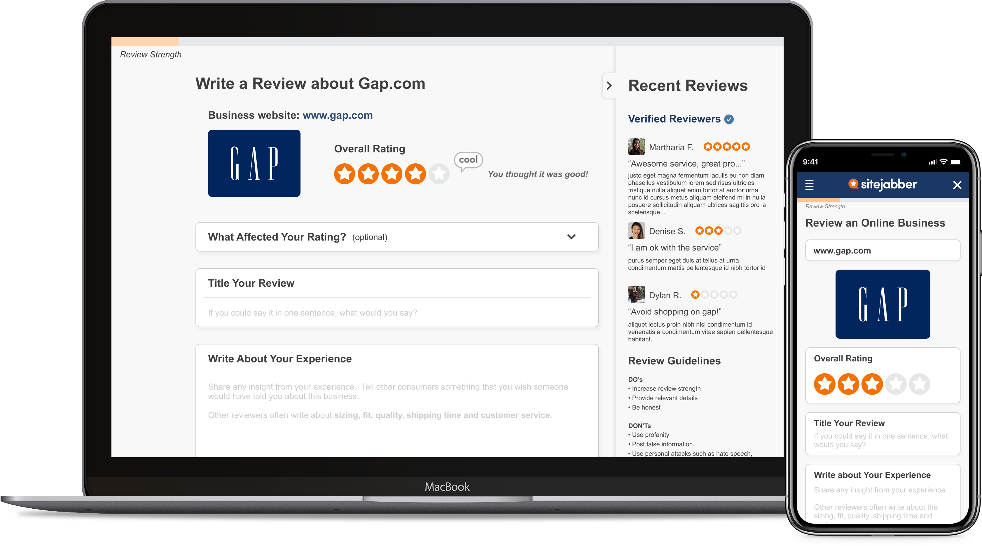
Share more with less effort
B2C - adaptive web - review form
B2C | web, adaptive mobile
----
Overview
Sitejabber was puzzled as to why most reviewers only review once. To find out the root cause, we spoke to users to understand their motivation when writing reviews and we conducted usability testing to find issue with the existing review page.
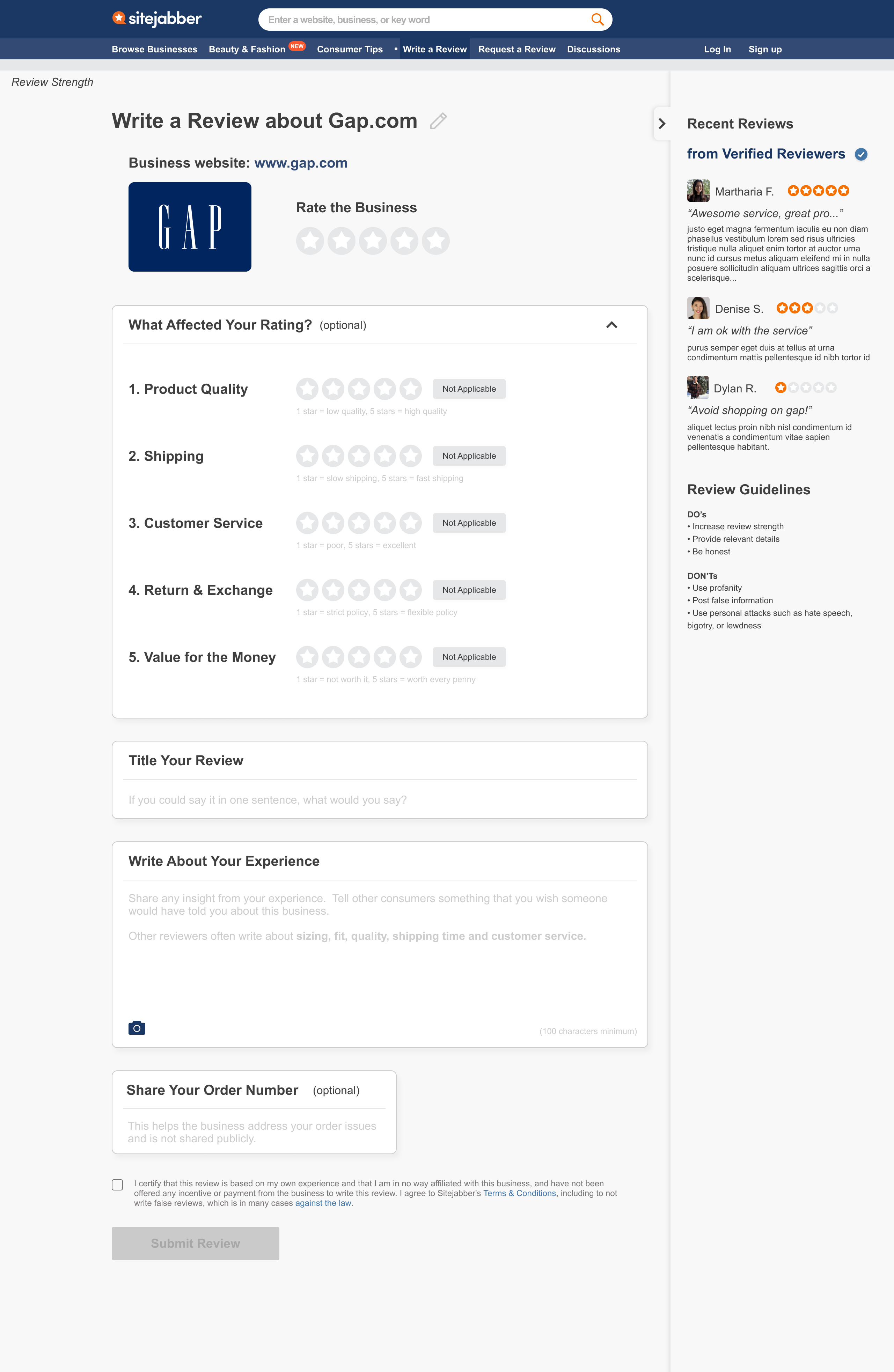
The research takeaways led to a review page redesign. The main redesign includes a progressive disclosure technique to reduce cognitive workload and an indicator to promote sharing more about their shopping experience.
Prototypes of these concepts were created for validation. 5/5 users interviewed with the desktop prototype said the new interaction design made the review easy to fill out and 4/5 users felt the new "review strength" indicator encouraged them to share more information.
CLIENT
CLIENT
Sitejabber is a review platform for consumers to learn about ecommerce businesses
ROLE
Lead Product Designer
SCOPE
UX Research, UI/UX, Information Architecture, Interaction Design, Prototyping in 7 weeks
(Status: Delivered)
SOLUTION PREVIEW
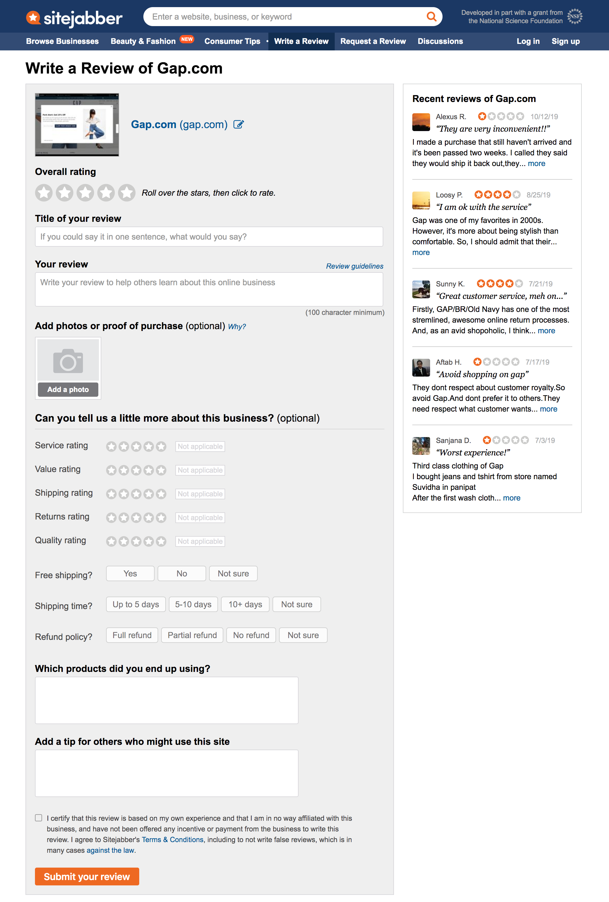
BEFORE
AFTER
Context
Context
Most reviewers write one review and don't come back, but why?
BACKGROUND
Based on data gathered from Google Analytics, only 7% of reviews are from repeated reviewers.
Because Sitejabber is an user-generated content (UGC) site, having reviewers consistently write reviews is crucial to the business's growth. These reviews not only help generate traffic on the consumer side but also attract businesses to Sitejabber for analytics features and data insights.
PROBLEM STATEMENTS
- How might we improve the user experience on the "write a review" page to encourage reviewers to come back to write more reviews on other businesses?
- How might we help reviewers include information in their reviews that readers find useful?
CONSTRAINTS
![]() Scope limitations
Scope limitations
Redesigning the review page was the scope proposed by the client. Although we found through research that fake reviews to be the underlying issue, shifting the project objective will extend the project timeline and need a budget increase. Ultimately, it was decided to proceed with exploring redesign options.
![]() Working with existing structure
Working with existing structure
Since there are invaluable data collected with the 5 rating categories (service, value, shipping, returns, quality), modifying this was out of question.
Research
Key findings from users and companies in different industries
METHODS + KEY INSIGHTS
![]() Usability Testing
Usability Testing
2 existing Sitejabber, 3 first time users were interviewed for feedback on the existing review page. They were given two shopping experience scenarios (1 positive and 1 negative) and asked to openly discuss how they were fill out the form.
After synthesizing, the key usability issues were:
- Discoverability
0/5 users noticed the "more about business" section but said section was useful after being prompted to expand the section. - Comprehension
0/5 users understood the intent of "which products did you end up using?" and were unclear about other questions asked in the "more about business" section.
![]() Comparative Analysis
Comparative Analysis
Yelp is the top review platform for restaurants; Tripadvisor for travel destinations; Amazon for most products in the world. The team looked into these websites to find design patterns that contribute to their user experience:
- Yelp praises reviewers with toast messages as they type the review and offers option for users to hide recent reviews
- TripAdvisor tailors the questions to the specific business (hotels, restaurants, parks, etc.)
- Amazon's reviewers write mostly about what they purchased and share information on fit, quality, and body measurements for clothing items
![]() Design Patterns
Design Patterns
Different design patterns were explored to determine how the page can be redesigned to improve the user experience.
- Sectioning review form because users think in batches and will help get through it faster
- Carousel and progressive disclosure are two common ways to simplify high volume of information
- A visual gauge can trigger the Zeigarnik Effect which encourages users to fill out empty form fields
Solutions
Research-based design solutions
![]() A new layout to reduce user's cognitive load
A new layout to reduce user's cognitive load
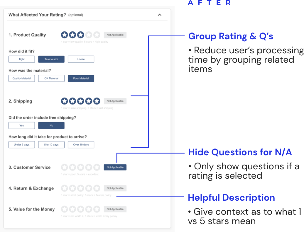
- rearrange the "more about business" section based on user's shopping experience
- group ratings and alike questions together
- provide common answers to questions
clarify each category rating with helper text and a friendly, direct tone
![]() Revew strength feature as a motivator
Revew strength feature as a motivator
- provide a visual cue for users to see progression of their review
- establish system for future rewards program integration
Solution 1 of 2
Restructure layout for better experience
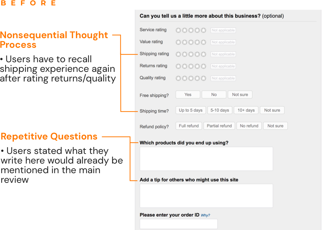
A consistent usability issue found during testing was that users did not notice the "more about business" section. 0/5 tested users saw this section.
However, after being prompted to the section, users commented that these additional ratings and questions were easy to fill out and said it was "helpful for consumers" and "can provide a lot more info to help the business out".
Several ideas were explored using content in the section.
IDEA 1. Focus review on the products
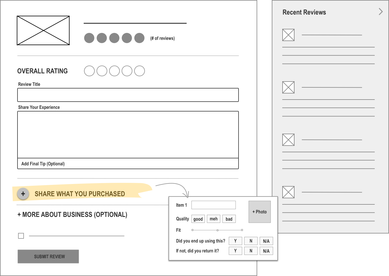
WHY WE PIVOTED FROM THIS DESIGN
Client explained that SiteJabber is intended to be a business focused (customer service, shipping, etc.) review site rather than a product focused one.
IDEA 2. Reduce 5 categories to 2
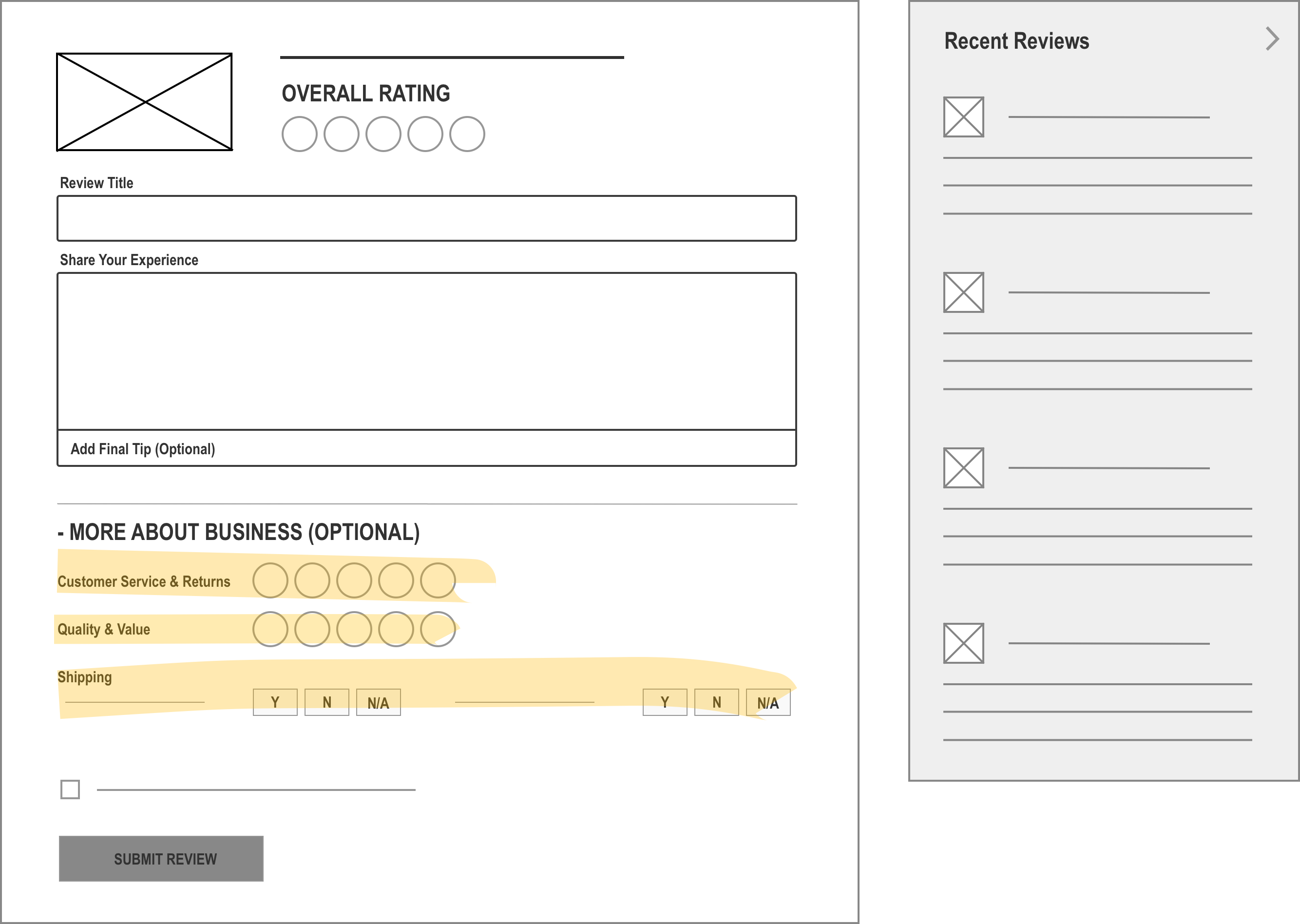
WHY WE PIVOTED FROM THIS DESIGN
SiteJabber has a lot of data around the 5 categories system and want to avoid restructuring the existing database.
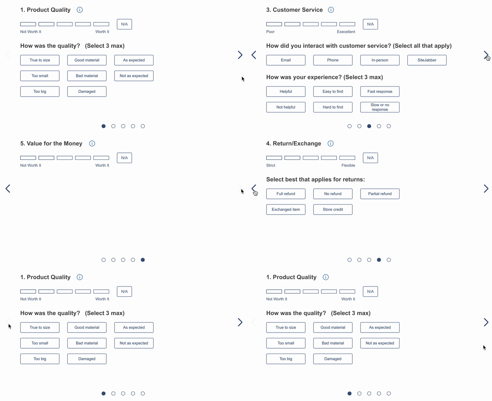
IDEA 3. Explore carousel and progressive disclosure layout patterns
Carousel Pattern
Progressive Disclosure
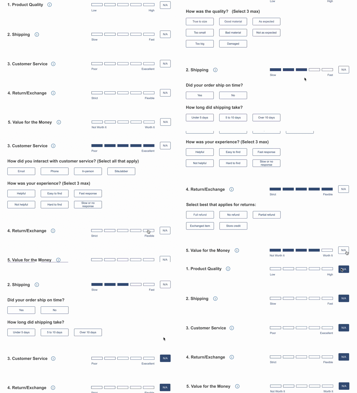
USER FEEDBACK
Both designs were created as clickable prototypes and shown to users. 5/5 users preferred the progressive disclosure pattern over the carousel. Users stated that they preferred seeing all category ratings immediately vs needing to click in order to see the rest.
----
FINAL DESIGN - LAYOUT
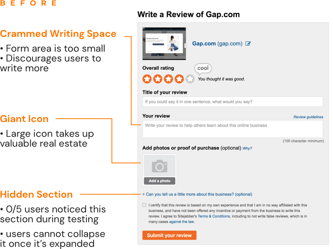
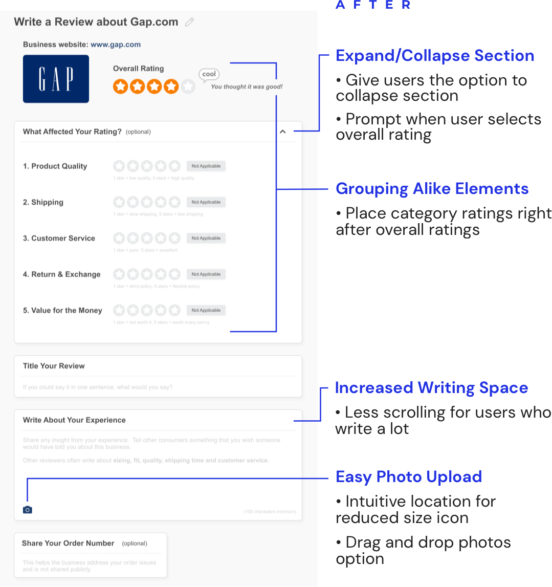
FINAL DESIGN - EXPANDED LAYOUT
"Write a Review" page - "About Business" expanded section
Solution 2 of 2
Give users a reason to share more
The "Zeigarnik Effect" concept is explored in attempt to motivate users to share details on their experience with an online business. If users consciously see something gauging their review's completeness, in theory, users are more motivated to complete it fully.
ITERATION 1. Circular strength meter with percentage
Why we pivoted from this design:
Numerical scale is not the best metric for reviews.
ITERATION 2. Replace percentage with descriptive copy
Why we pivoted from this design:
One user indicated she felt "judged" during concept validation.
ITERATION 3. Linear progress bar
Why this design is the winner:
The linear progress bar doesn't include text description, however it's clear as user progresses.
----
FINAL DESIGN
The final strength meter includes supporting copy intermediately to further encourage users to add more information to their review.

----
Results
To verify the impact of the concepts, 10 users were invited to give feedback to the designs. 5 users were interviewed with 2 desktop prototypes and 5 with 2 mobile prototypes. Here are a summary of the results: *mobile version results not included
DESIGN AREAS
![]() "More about business" category rating section
"More about business" category rating section
![]() Create a review strength meter to motivate users
Create a review strength meter to motivate users
BEFORE
0/5 users clicked on the "more about business" section until being asked. All users were confused about categories & questions
N/A
AFTER*
5/5 users interviewed with desktop version liked the progressive layout and indicated the categories & questions were clear and useful
4/5 desktop users thought the review strength was encouraging while writing the review
Final Work
PROTOTYPE (WEB)
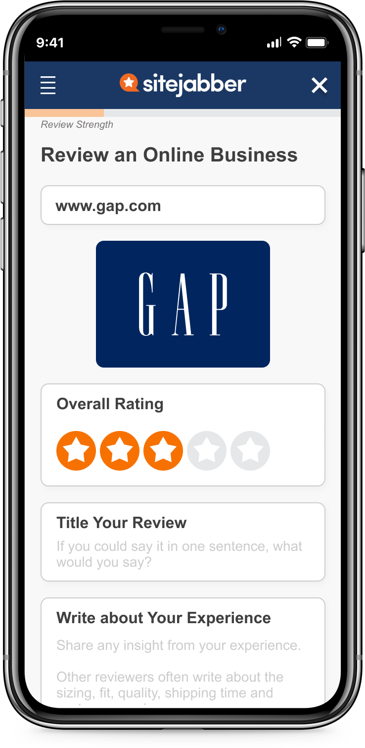
SCREENS FOR MOBILE WEB
"Write a Review"
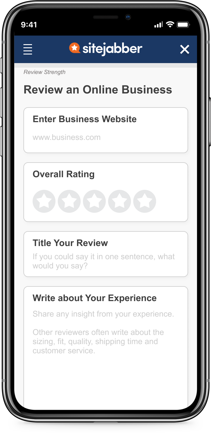
After Selecting Business
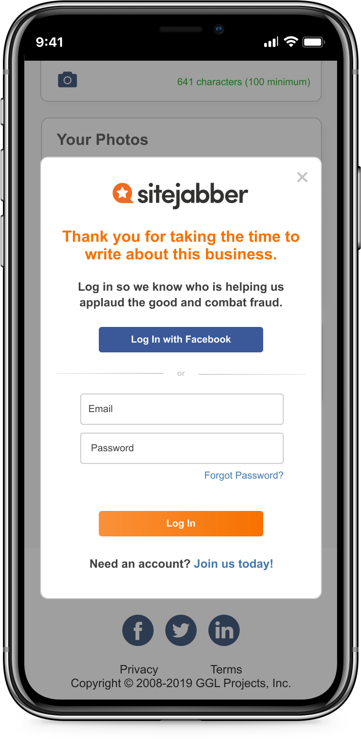
Sign In Modal
Reflection
![]() Pinpointing which design improvements made most impact was a challenge
Pinpointing which design improvements made most impact was a challenge
From the business perspective, knowing how easy a feature is to implement versus its impact is important because this information can be used to prioritize what needs to get done.
The final design proposed includes multiple improvements in copy, layout, and even adding a new concept (review strength). Although users feedback for the design was positive, it's unclear how the improvements rank based on impact.
Therefore, it will be more telling if we did more rounds of A/B testing comparing the original design versus the improvments individually.
![]() If I can do it again with a bigger budget and more time...
If I can do it again with a bigger budget and more time...
I would do extensive research around combating fake reviews. The reason is because I strongly believe the most one-time reviewers are fake reviewers. Therefore, I would find design patterns that increase friction for fakers (user or purchase verification) or spend time to develop designs that address this issue.
Secondly, recruiting existing SiteJabber reviewers was a challenge. For this iteration, we were only able to recruit 2 existing SiteJabber reviewers. If we have more time and budget...
- Conduct more interviews with SiteJabber reviewers
Reason: to dive deeper into why they aren't writing more reviews - Interview users who read reviews on SiteJabber
Reason: it is just as important to understand what readers want to read about
Check out my other work: