
Giving parents clear reasons to bring diversity to their bookshelves
Giving parents a clear reason to teach diversity
B2C | responsive web | landing page, product page
Overview
CLIENT
Little Feminist is a monthly children book subscription that deliver books with inclusive characters and themes (eg. cultural diversity, LGBTQ families, disabilities, & more).
Little Feminist is a monthly children book subscription that deliever books with inclusive characters and themes (eg. cultural diversity, LGBTQ families, disabilities, & more).
ROLE
Product Design Consultant
SCOPE
UX Research, UI/UX Design, UX Writing, Visual Design, Branding in 7 weeks
(Status: Delivered + Shipped)
Context
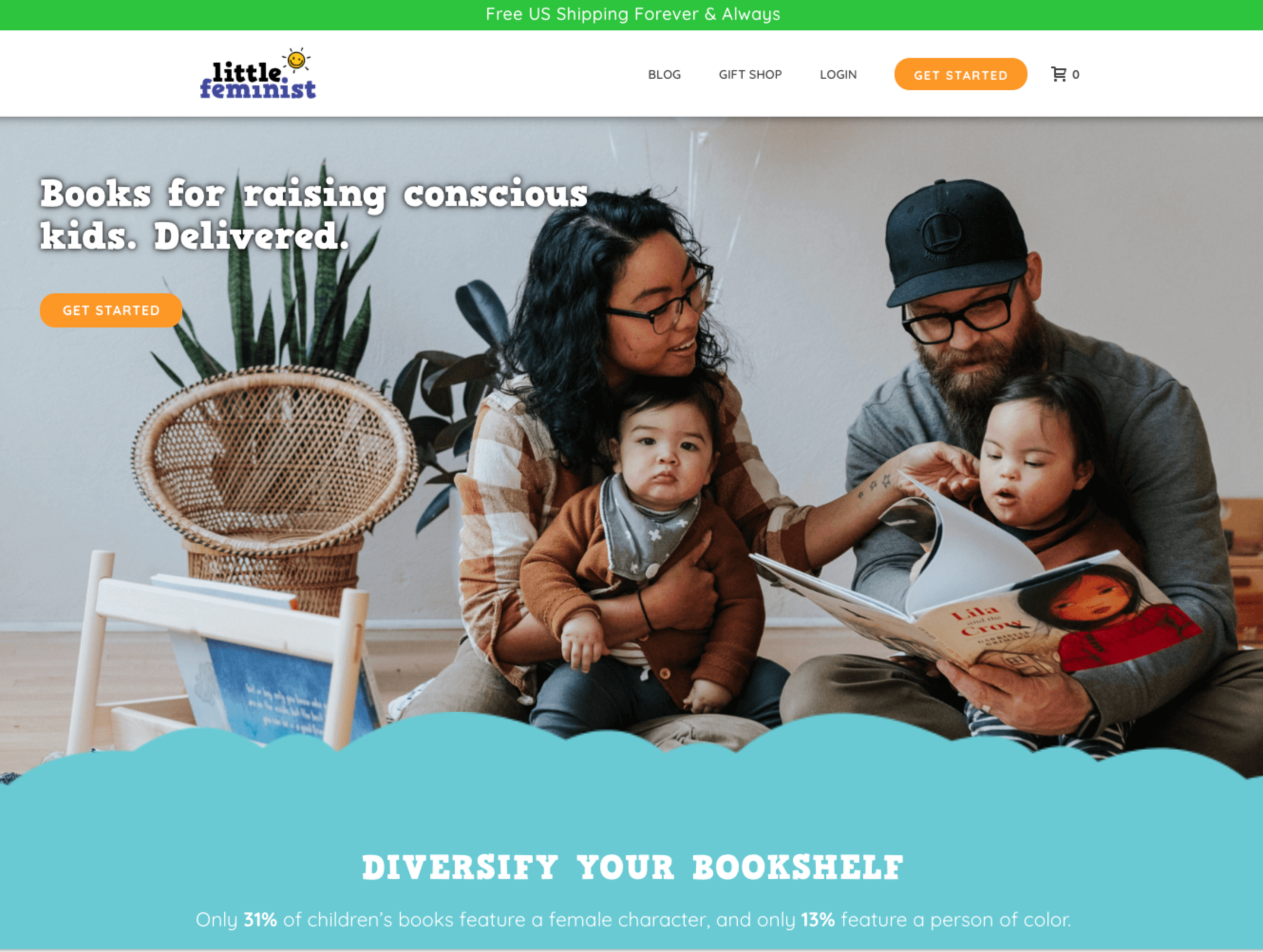
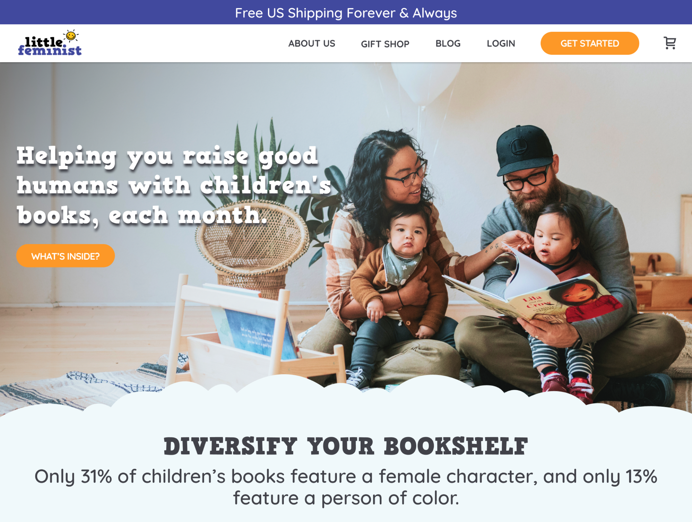
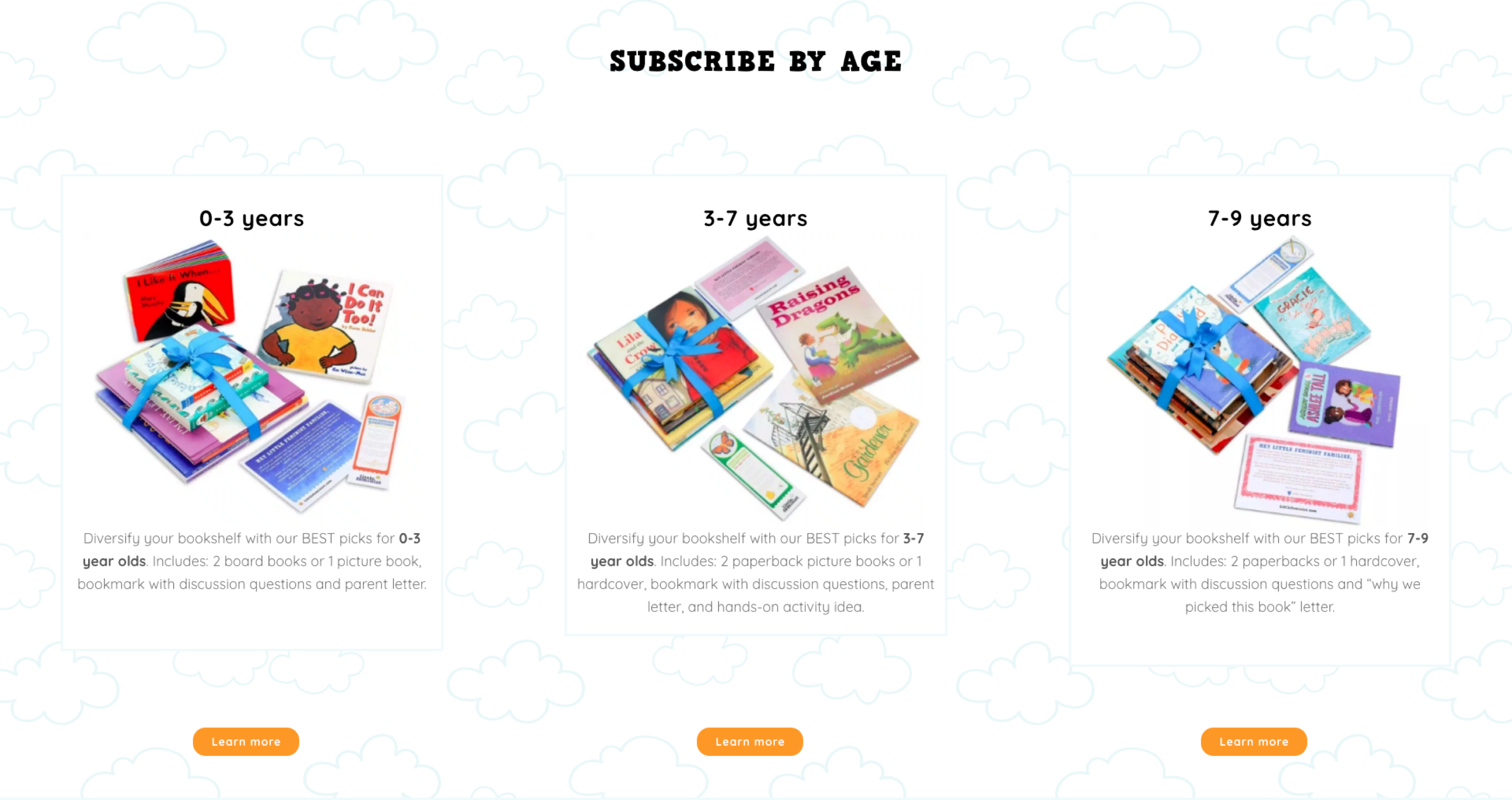
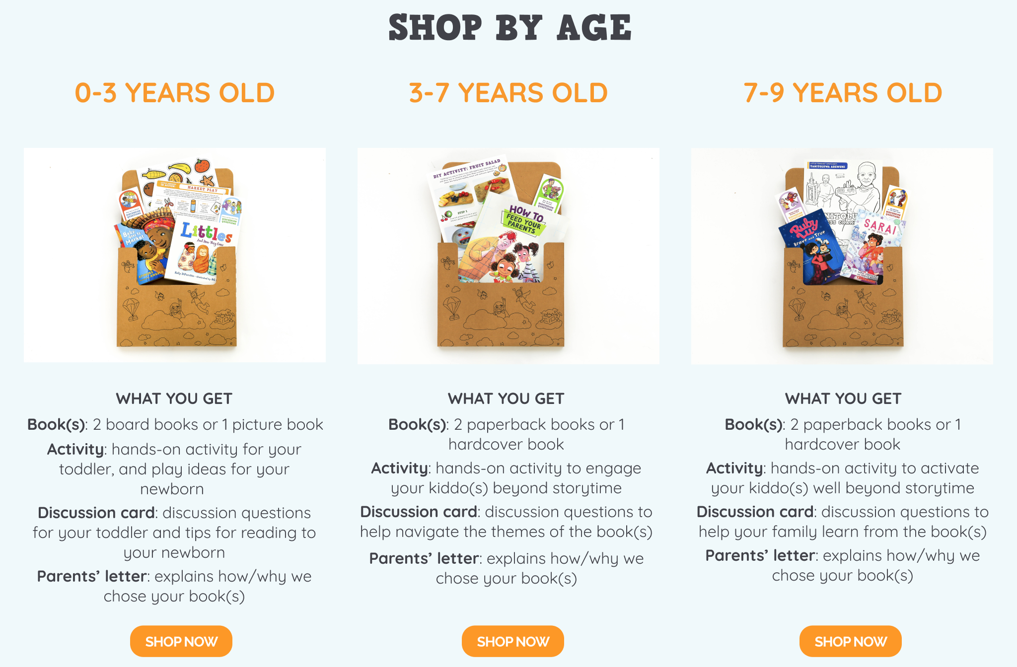
Parents are unsure what they're getting when subscribing to Little Feminist.
BACKGROUND
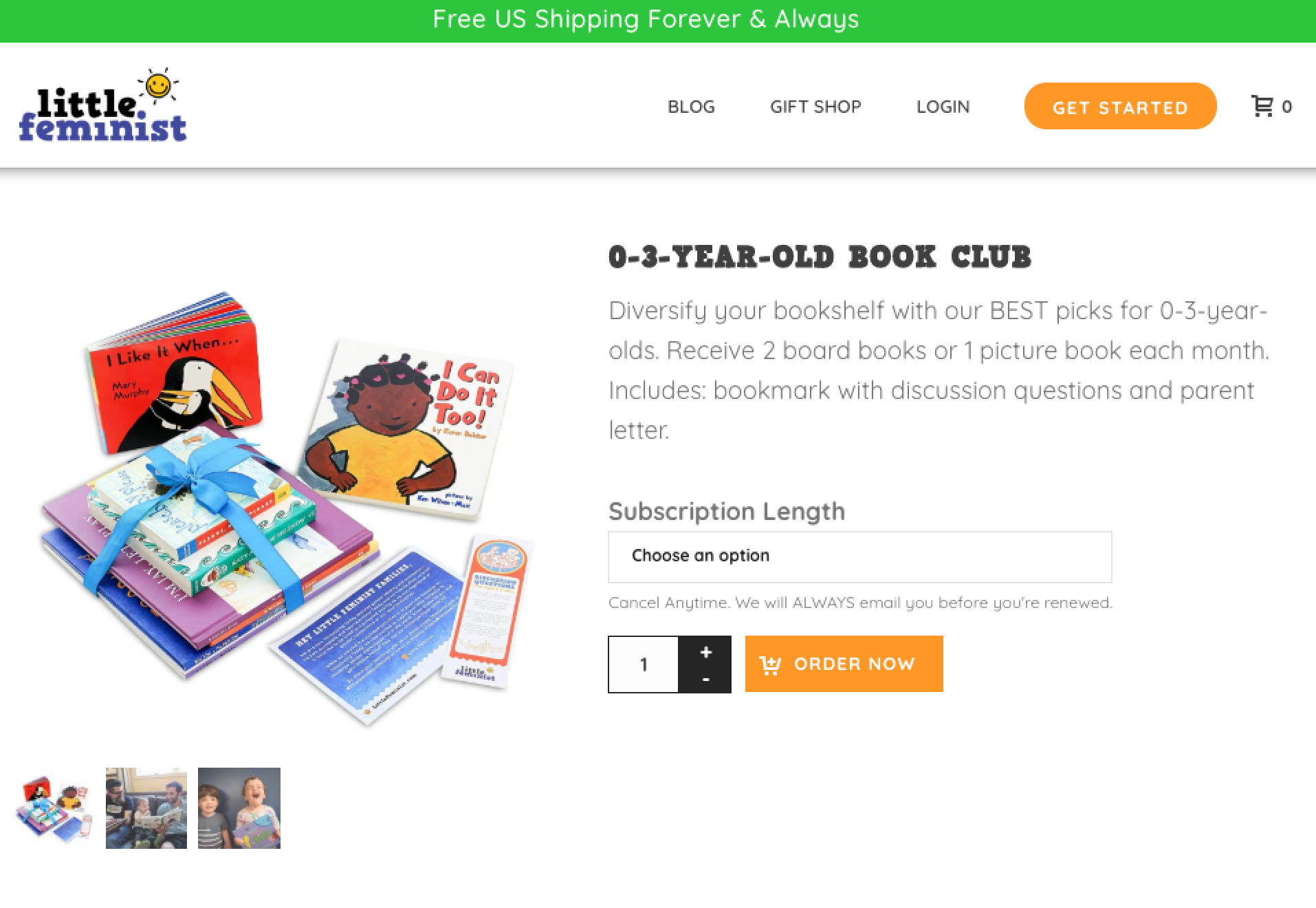
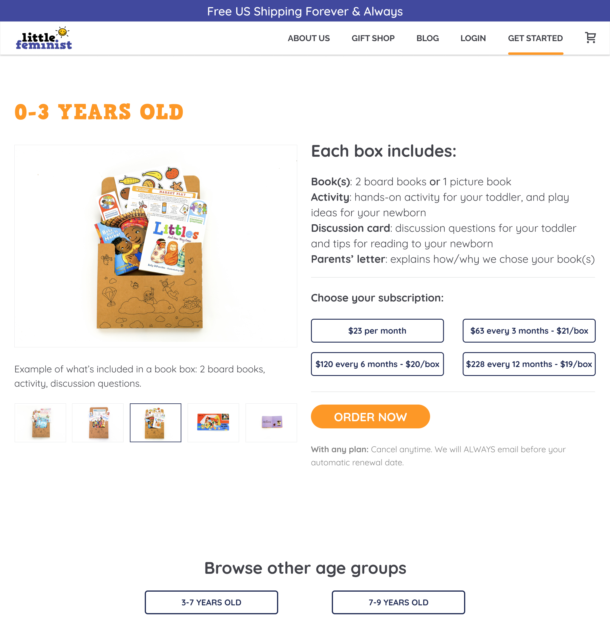
The confusing copy and misleading images on Little Feminist's homepage have contributed to a 42% drop-off rate. Potential subscribers have also turned away due to the inconsistent pricing shown on the homepage and product page.
HYPOTHESIS
Being clear on what each box comes with and how much they pay will reduce the drop-off rate and increase conversion.
PROBLEM STATEMENTS
- How might we redesign the home page and product pages so users are clear on what they'll get when they sign up for a subscription?
- How might we present the different subscription plans so users understand how they differ and amount they are charged at time of payment?
- How might we improve the navigation between the home page and the 3 different product pages for better browsing experience?
Design Process
Not shown, but happy to discuss offline. Let's chat!
Final Design
LANDING PAGE - HERO & CTA
BEFORE
AFTER
LANDING PAGE - PRODUCT LISTING
BEFORE
AFTER
PRODUCT PAGE - (AGE 0-3Y SUBSCRIPTION)
BEFORE
AFTER
Check out my other work: