Easy payment for a bold fitness decision
B2C - responsive web - checkout flow, account settings, cancellation flow
----
Overview
Bold was prepared to roll out their new subscription model to convert trial members to paid members; however, they did not have a payment gateway for members to do so. Because the intended demographic (adults age 60+) are often perceived as less "tech-savvy", it was important to conduct extensive research by observing how they typically make online payments and identifying pain points during the process.
We gained a deeper understanding of the user group through research, which led to designs that made it easy for users to pay, edit and cancel their memberships.
CLIENT
Bold, a digital fitness program that tailors to the user's fitness goals and offers exercises that help improve strength, mobility, and balance.
ROLE
Product Design Consultant
SCOPE
Research, UI/UX Design, A/B Testing, Prototyping in 7 weeks
(Status: Delivered + Shipped)
Context
Changing membership status from beta to committed
BACKGROUND
Bold developed a new subscription model and required design work around the payment gateway. A new checkout flow need to be designed to let users choose a desirable plan and to provide all necessary payment information. Additionally, the existing account settings needed to be redesigned to allow members to change their billing information and to cancel their memberships.
BUSINESS GOALS
- Convert existing free trial (beta) users to its subscription model
- Drive engagement and subscriptions from new users
- Provide options to allow coupons and be purchased as gift
- Understand why and gather feedback if user cancels plan
PROBLEM STATEMENTS
- How might we develop one payment flow that services different user groups (existing users, new users, and gifters)?
- How might we modify the account settings page so users can make changes to their membership plan and payment info?
- How might we design an experience for users to cancel the membership while offering opportunities to reconsider?
Research
The insights learned from other products
METHODS + KEY INSIGHTS
![]() User Interview/Usability Testing
User Interview/Usability Testing
Since Bold did not have an existing payment flow, the usability testing was conducted by using other sites that have similar target customers. The objective was to uncover painpoints users may have during checkout.
Two groups of users were interviewed:
Group 1: intended members, adults who would become a member
Group 2: intended gifters, children who would gift the membership to their parents

Umbrella was used to interview intended members and StoryWorth was used to interview intended gifters.
Key Insights:
- Scam is a major concern for intended users and gifters
- Target demographic takes time to read thoroughly
- Appreciate larger font sizes
- Prefer details on pricing and products
![]() Product Research
Product Research
Understand common design patterns to determine what drives conversion and reduces drop-off.
Key Insights:
- Design with easy field first, hard field last
- Label steps clearly
- Provide clear CTA to distinguish gifting
- Include personalized message field for gifting
Solutions
![]() Implement an easy to use process for sign up
Implement an easy to use process for sign up
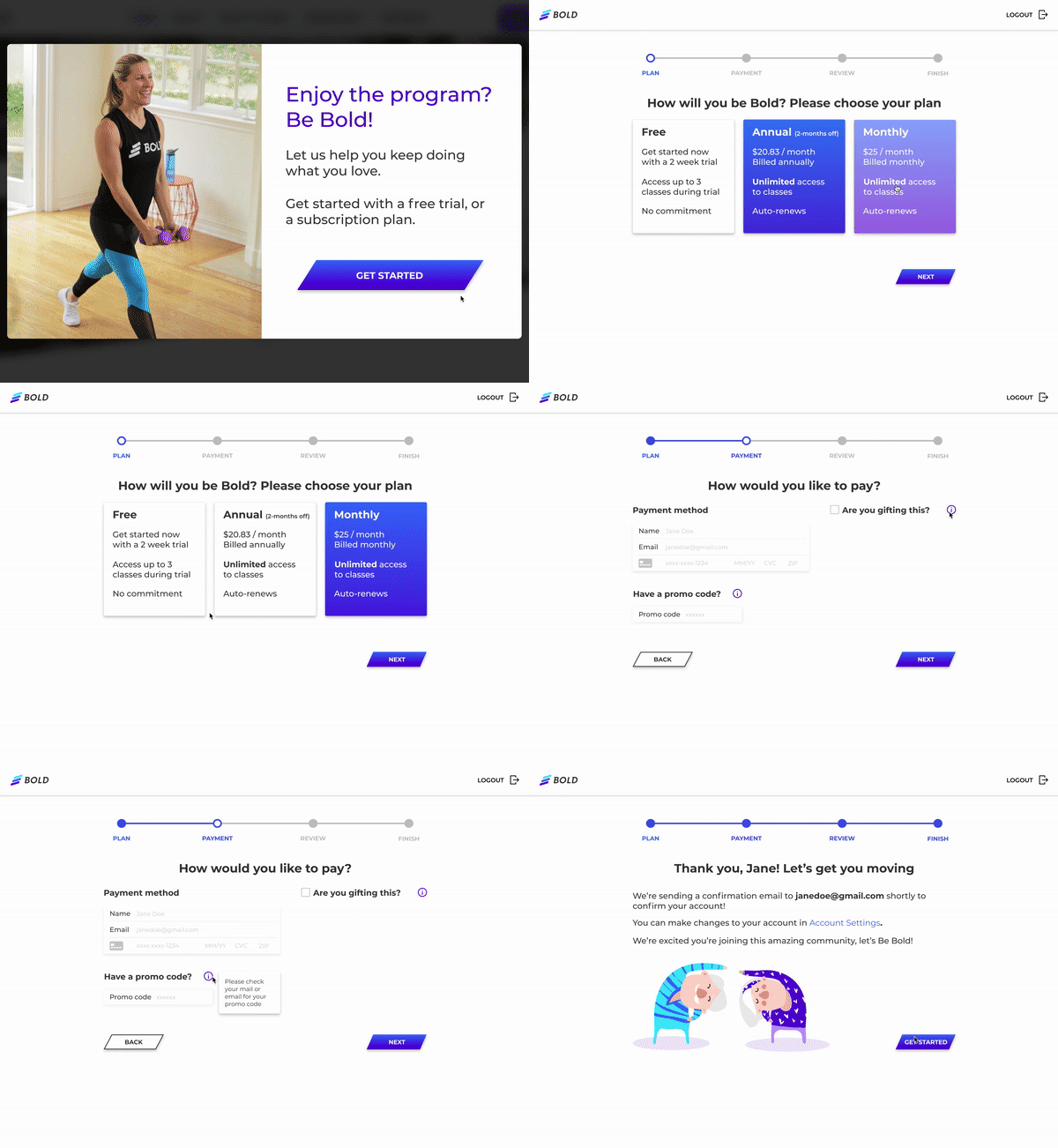
Pick a plan and indicate if its for themselves or a gift
Enter payment info
Review and confirm
Thank and welcome the user!
![]() Reformat account settings to include billing info and subscription plan
Reformat account settings to include billing info and subscription plan
- Redesign account settings page to allow users to change billing info
- Show subscription options and allow users to change and cancel subscription plan
- Include copy to remind when membership renews
![]() Strategize with empathy during cancellation
Strategize with empathy during cancellation
- Leverage loss aversion concept to retain the user
- Collect user feedback for business
Solution 1 of 3
Do users prefer one-pager or step-by-step payment flow?
After first iteration of wireframes and dogfooding among the team, two prototypes were created for user's feedback. One layout is to show plan details, plan choices, and payment info on one page. The second layout is to break out into plan choices, payment info, order summary, and confirmation page.
Layout 1. Single-page layout with plan tiers, payment info, and gift option.
Layout 2. Multi-page layout with a progress indicator of the 4 steps.
FINAL DESIGN
5/5 interviewed users preferred the mult-page layout during validation testing, therefore is used for the final design.
Solution 2 of 3
Account settings: one-page or tab navigation?
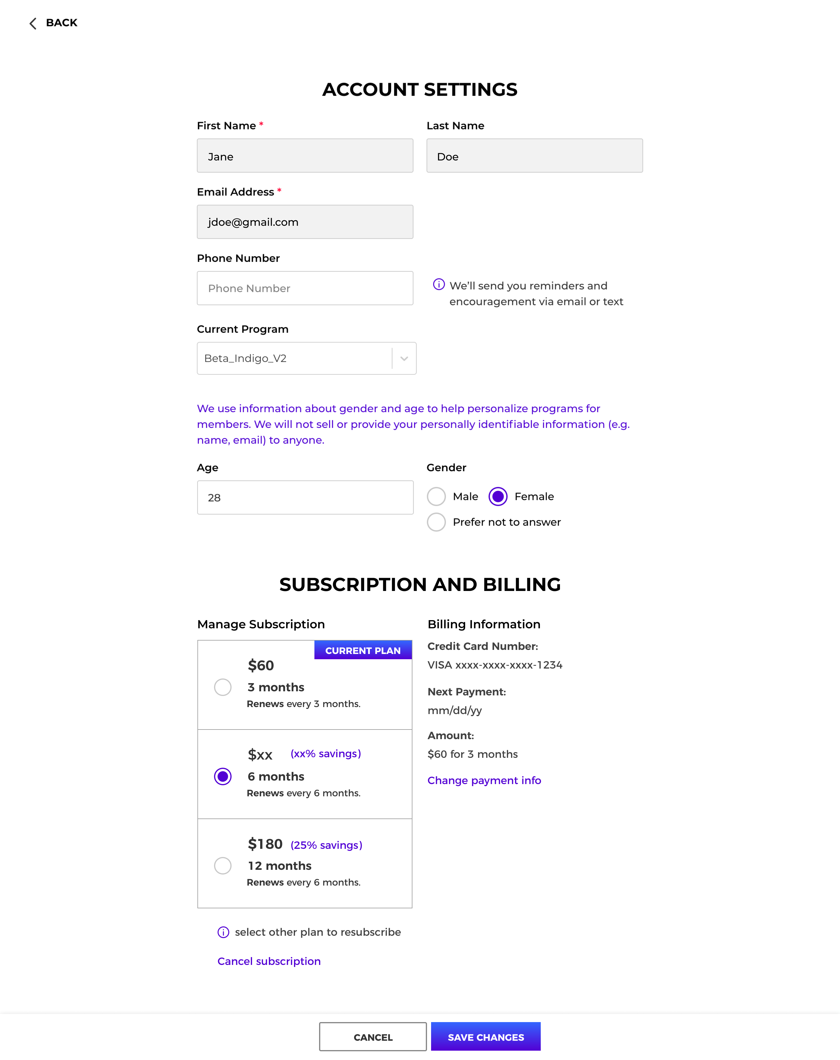
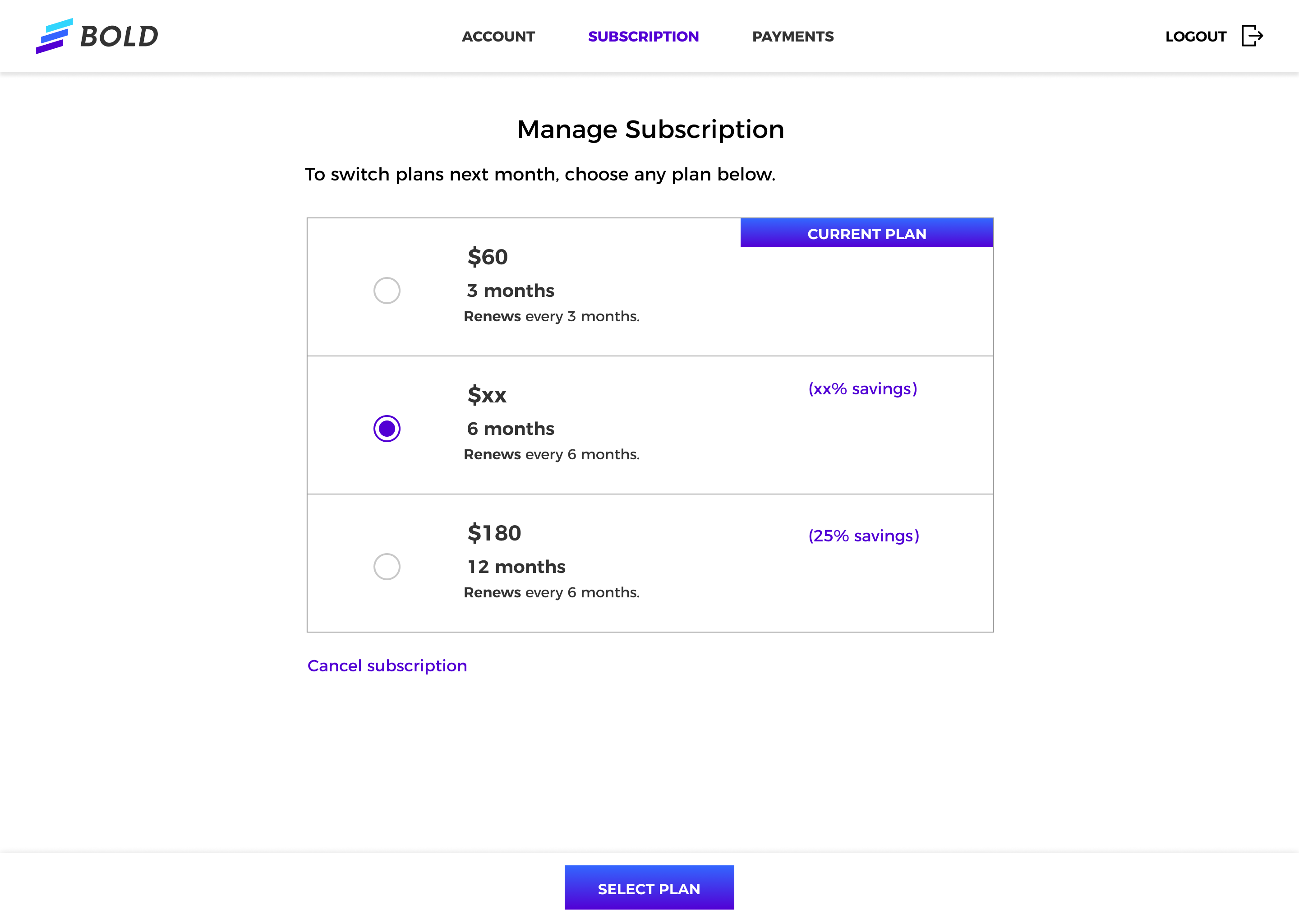
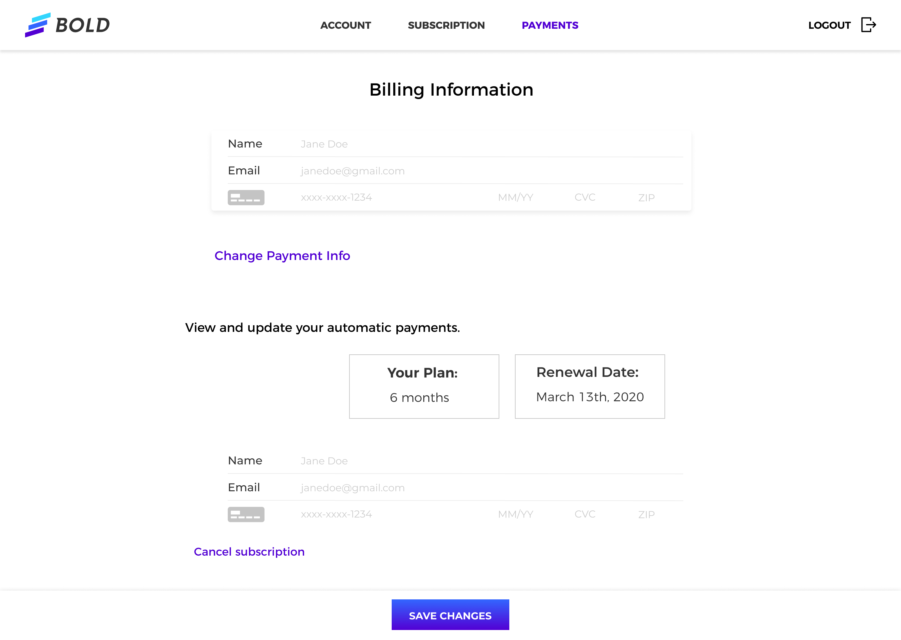
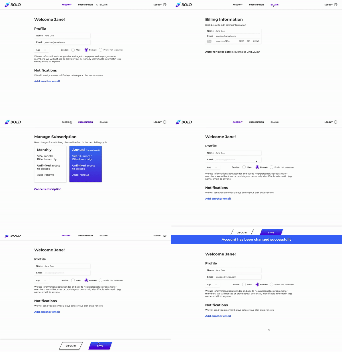
The website does not include information about the subscription plan and billing information. Two layout ideas were considered; add subscription and billing to the existing account settings page shown as Layout 1; create pages for subscription and billing with tab navigation show as Layout 2.
Layout 1. Single-page with account, subscription, & billing info.
Layout 2. Additional pages for subscription and billing with tab navigation.
FINAL DESIGN
Users were only tested with the one-pager layout for the account settings during validation testing. Although the overall feedback was positive, we observed that the users had to scroll to find the plan and billing info. Thus, the final design divides the page into 3 and incorporates a tab navigation.
Solution 3 of 3
Part in good terms, learn why users want to leave
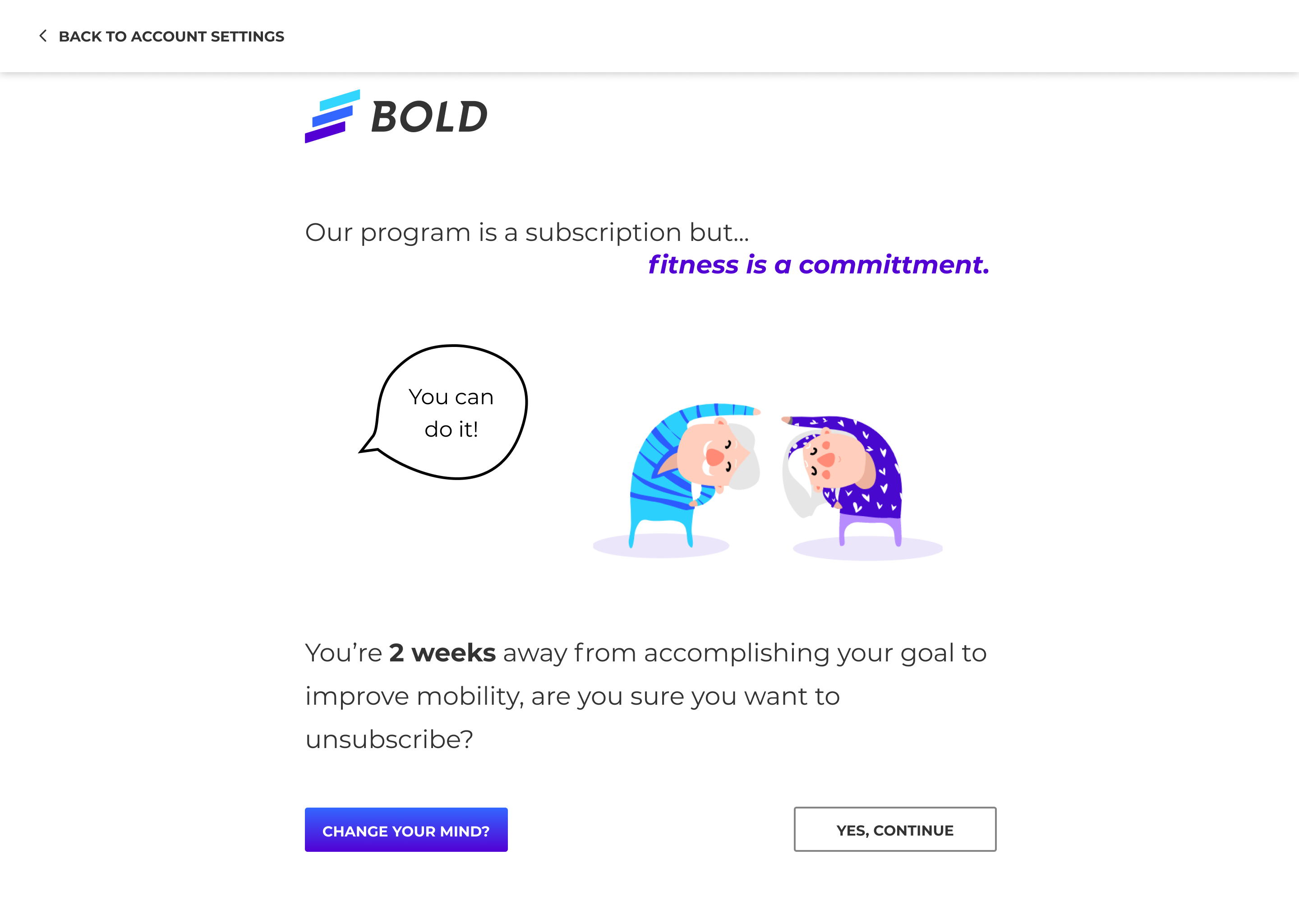
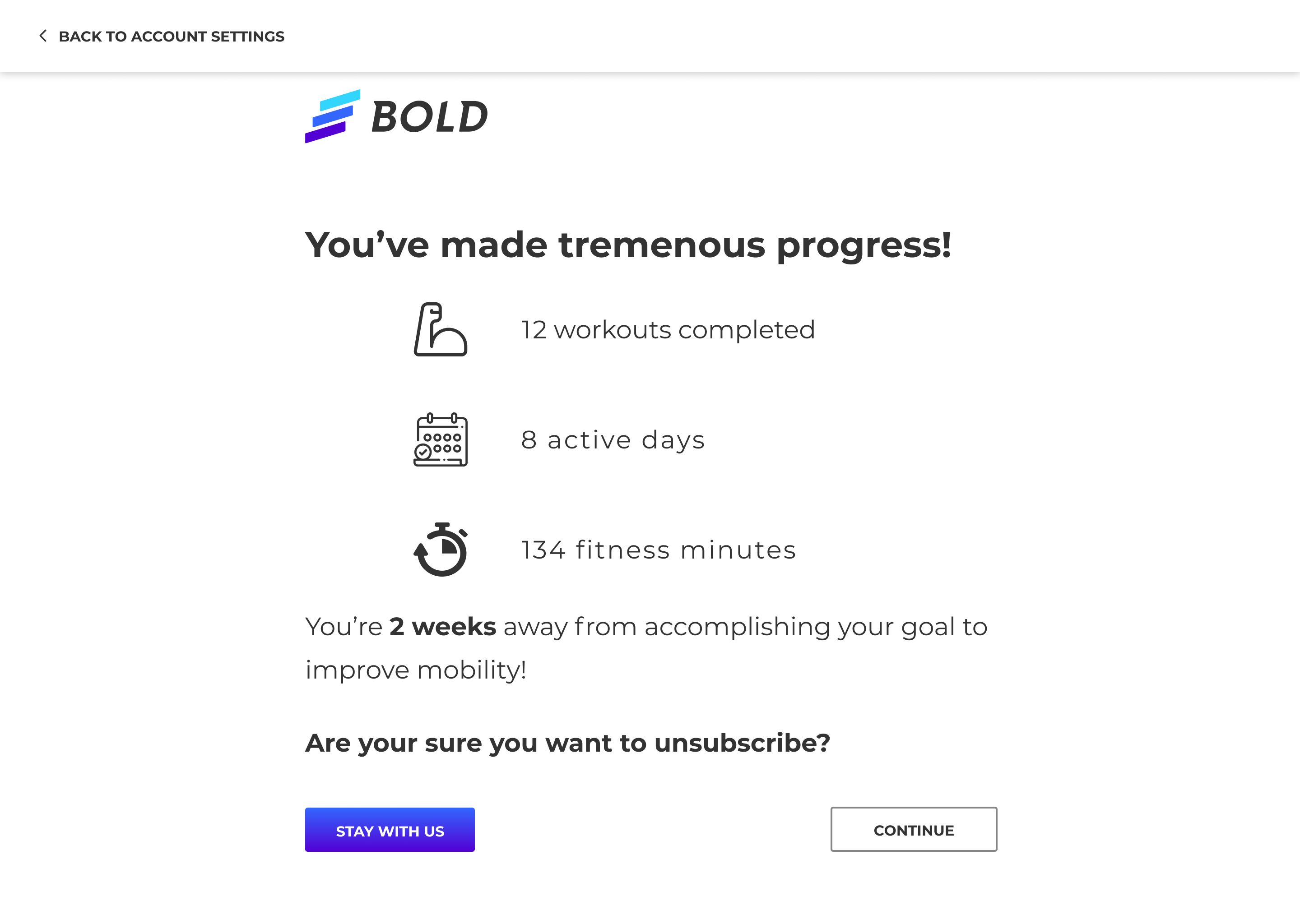
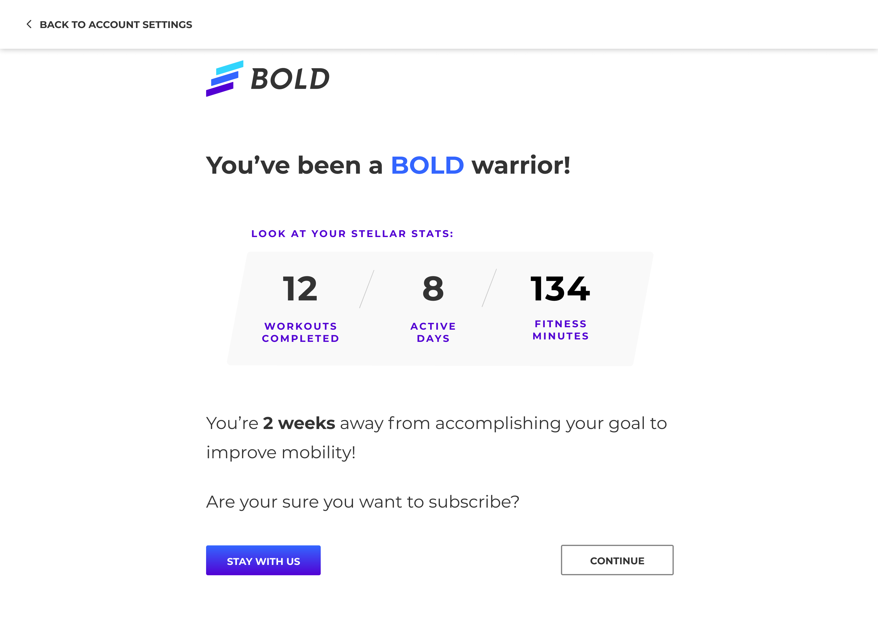
The client wanted to implement a painless process for cancelling subscription and also want to get feedback on why the member cancelled the subscription. Here are some design options for the first screen that user would see during the cancellation flow.
Design 1. Reuse an existing graphic and remind users what fitness is about
Design 2. Use icons along with showing user's progress stats
Design 3. Reuse existing UI design from dashboard to show progress stats
Design 4. Show completed progress and how close it is to achieving goal
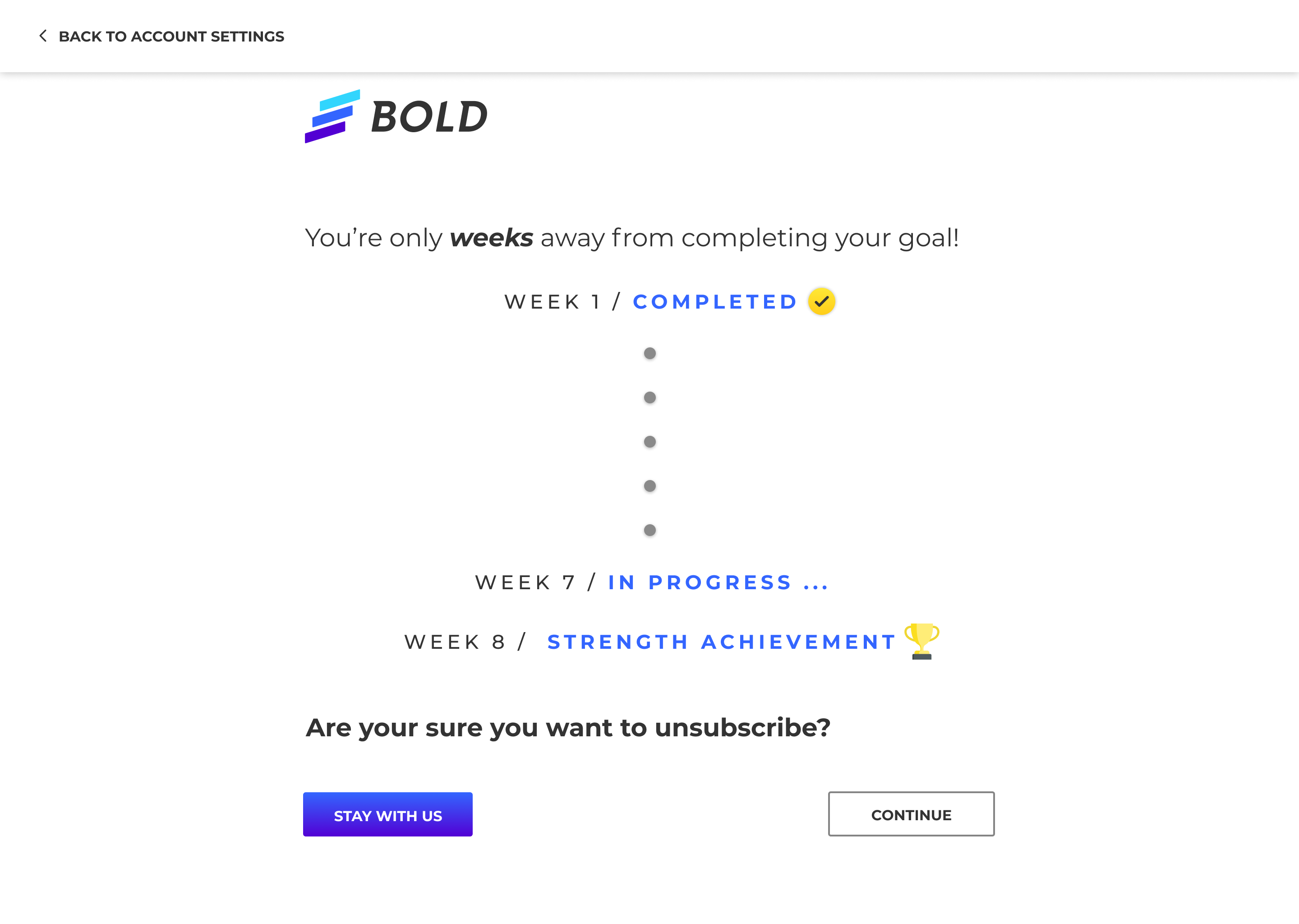
FINAL DESIGN
Design 2 was chosen to be final design while changing the icon color to capture the user's attention towards the fitness progress data.
Final Work
Don't sweat it while paying, save it for the workout
![]() 4-step Payment Flow
4-step Payment Flow
The user is guided through the following steps as they checkout:
Step 1. Choose the subscription plan
Step 2. Input their payment info and select if this is a gift
Step 3. Review selection and input info then confirm
Step 4. Be thanked and encouraged to get started

![]() Account Settings
Account Settings
The user can navigate through account, subscription, and billing seamlessly to make changes.

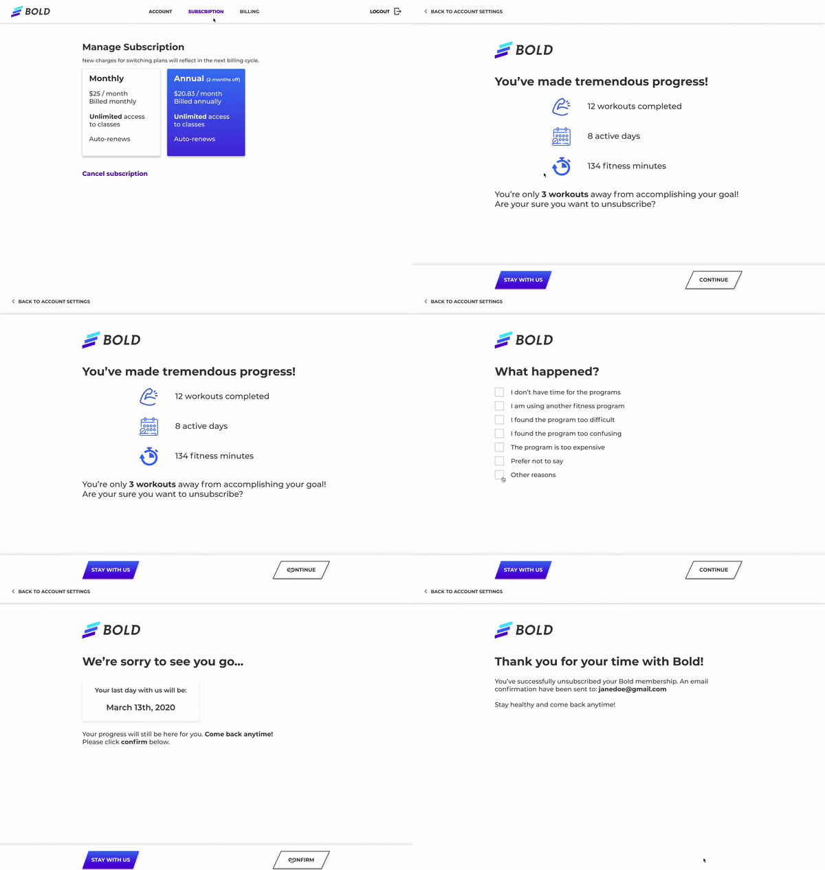
![]() Cancellation Flow
Cancellation Flow
The first thing they see during the cancellation flow is their progress. The next page is to understand why the user to leaving. Lastly, the user is reminded the last day of the membership and ends with a confirmation page.

Reflection
![]() The gift of working in agile environment
The gift of working in agile environment
I was tasked to design the cancellation flow. Because we wanted to get user feedback on our design as soon as possible, I was told that I have 10 mins to ideate then create as many sketches to present within hours. I worked quickly and came up with the sketches shown in Solution 3 section.
What I've learned is that having more rough sketches is a much better approach than spending days on a pixel perfect idea. This allows for quicker iteration, more feedback loops which leads to better designs.
![]() Building empathy towards an older demographic
Building empathy towards an older demographic
I had the pleasure to speak with users who are age 50+ during research and validation phase. This was an amazing opportunity for me to gain insight on how an older age group may might interact with web products differently.
One of the most interesting observations was that they read in details, which was a behavior we assumed associated with the demographic. Based on the users' responses, reading thoroughly correlates with their fear of being scammed.
Also, things that might be more intuitive to younger folks, such as what a cvc is, might not be for others. Thus, understand who you're designing for and build with their pain points in mind, not yours.
Check out my other work: